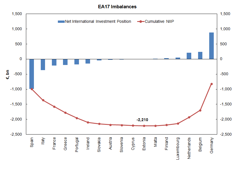
Found this graph at this hilarious blog which quotes Diapason Research. The graph plotted by the researchers uses cumulative current account balances from IMF’s data. I instead directly used the Net International Investment Position at the end of Q3 2011 from Eurostat.
The blue bars plot the net indebtedness of each EA17 nation (with signs reversed) and the red line is cumulative from left to right. It does not sum to zero because the Euro Area as a whole is a net debtor of the rest of the world.
The indebted European nations owe their creditors €2.2tn – which is almost 40% of the gdp of these nations as a whole.
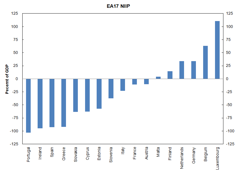
An alternative way to plot the NIIP- in ascending/descending order as a percent of gdp. Readers of the Concerted Action blog will know that I love the NIIP! I just found a nicer way to plot this. The alternative graph is below:

