… and not Infernal Muddles
Readers of this blog may be aware of my fanhood for Wynne Godley and the title of this post is from a paper by him from 2004, although it was US-centric. This post is on imbalances in the Euro Area.
Wynne had not only always foreseen crises, but also knew about the muddle in the public debate and in academia both before and after the crises and the policy space available to resolve the crisis. Here’s from the short paper:
The public discussion is fractured. There are vacuous suggestions coming from sections of Wall Street that Goldilocks has been reincarnated and everything is fine. There are right-wing voices calling unconditionally for cuts in the budget deficit. The Bush administration seems complacent and, thank goodness, is not being convinced about cutting the federal budget deficit any time soon. Many are concerned about the current account deficit. Some of them fear a big and “disorderly” devaluation of the dollar while others think the dollar isn’t falling enough. No one has a clear idea about what can actually be done, by whom, and when. I have no sense that anyone who pontificates on these matters (outside the Levy Institute!) does so with the benefit of a comprehensive stock-flow model—the indispensable basis for competent strategic thinking.
In his 1983 book Macroeconomics, with Francis Cripps, he wrote:
… Our objective is most emphatically a practical one. To put it crudely, economics has got into an infernal muddle. This would be deplorable enough if the disorder was simply an academic matter. Unfortunately the confusion extends into the formation of economic policy itself. It has become pretty obvious that the governments of many countries, whatever their moral or political priorities, have no valid scientific rationale for their policies. Despite emphatic rhetoric they do not know what the consequences of their actions are going to be. Moreover, in a highly interdependent world system this confusion extends to the dealings of governments with one another who now have no rational basis for negotiation.
Eurostat, the statistical office of the European Union published for the first time today the indicators of the “Macroeconomic Imbalances Procedure Scoreboard”.
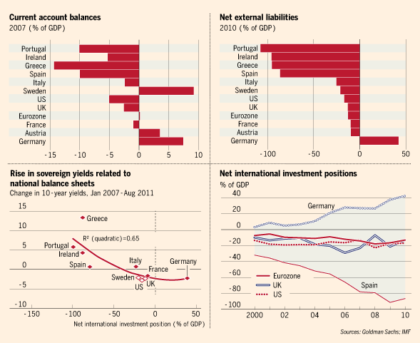
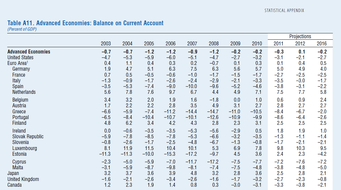
The Headline Indicators Statistical Information release provides detailed data (since 1995) for current account imbalances, the net international investment position, share of world exports, private credit flow (net incurrence of liabilities discussed in the previous post), private debt and the general government debt for the EU27 countries not just EA17. People a bit familiar about Post Keynesian Stock-flow coherent macro models will be aware of the connection between these.
The flow accounting identity
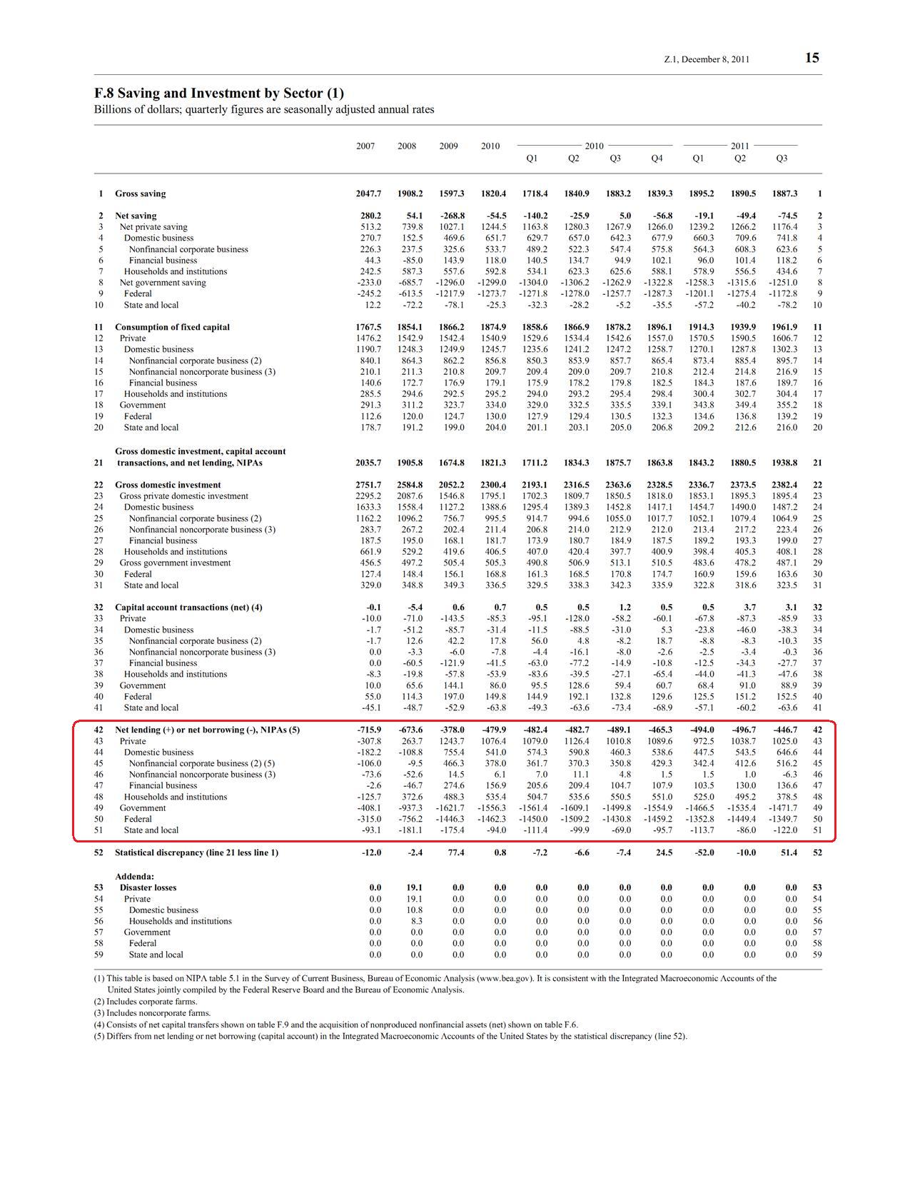
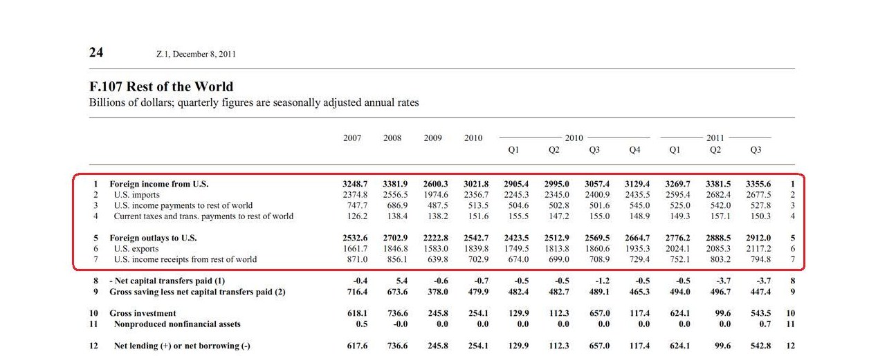
NL = PSBR + BP
where NL is the Net Lending of the private sector to the rest of the world, PSBR is the Public Sector Borrowing Requirement, equal to the government’s deficit and BP is the current balance of payments (or simply the current account balance) adds to stocks of assets and liabilities via the short-hand equation (also mentioned in the previous post)
Closing Stocks = Opening Stocks + Flows + Revaluations
and hence the connection between the stocks and flows mentioned by Eurostat. The report also provides data for Real Effective Exchange Rates, Normal Unit Labour Costs, evolution of House Prices (which rise faster in booms and do the opposite in busts) relative to prices of final consumption expenditure of households.
The Euro Area was formed with the “intuition” that by having a single currency, among other advantages – the nations would not have balance-of-payments problems at all.
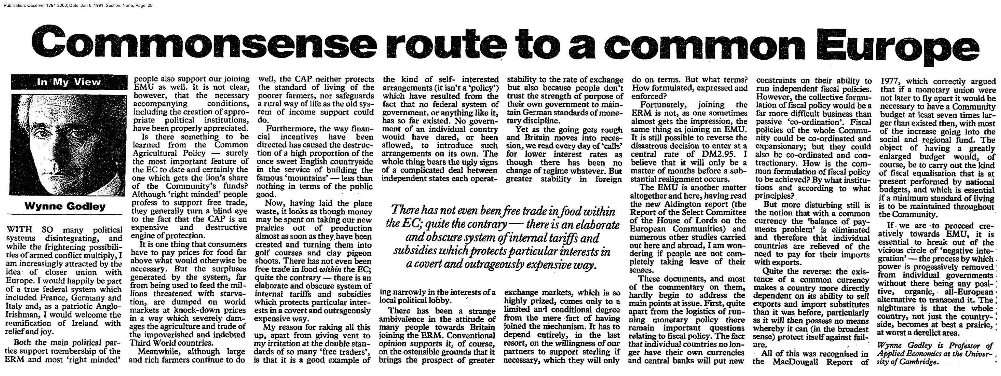
Wynne Godley saw this muddle as early as 1991:
(click to expand in a new tab)
Writing for The Observer where he said:
… But more disturbing still is the notion that with a common currency the ‘balance or payments problem’ is eliminated and therefore that individual countries are relieved of the need to pay for their imports with exports.
Quite the reverse: the existence or a common currency makes a country more directly dependent on its ability to sell exports and import substitutes than it was before, particularly as it will then possess no means whereby it can (in the broadest sense) protect itself against failure.
and that:
… If we are to proceed creatively towards EMU, it is essential to break out of the vicious circle of ‘negative integration’— the process by which power is progressively removed from individual governments without there being any positive, organic, all-European alternative to transcend it. The nightmare is that the whole country, not just the countryside becomes at best a prairie, at worst a derelict area.
The Eurostat is a statistical organization and its job is to report and maybe suggest some policies to the policy makers. It has rightly identified the imbalances which are looking for a policy. Unfortunately, these imbalances are typically brought to a balance (or at least attempted to) by deflating demand and hence reducing output and increasing unemployment. The recent treaty changes with a new “fiscal compact” shows what the policy makers are trying to do. But they do not realize its implications!
Here’s from a 1995 article A Critical Imbalance in U.S. Trade written by Godley:
Refuting the “Saving is Too Low” Argument
It is sometimes held that, in the words of the Economist (May 27. 1995, p. 18), “America’s current account deficit is enormous because its citizens save so little and its government spends too much.” The basis for this proposition is the accounting identity that says that the private sector’s surplus of saving over investment is always equal to the government’s deficit plus (or minus) the current account surplus (or deficit). As this relationship invariably holds by the laws of logic, it can be said with certainty that if private saving were to increase given the budget deficit or if the budget deficit were to be reduced given private saving, the current account balance would be found to have improved by an exactly equal amount. But an accounting identity, though useful as a basis for consistent thinking about the problem can tell us nothing about why anything happens. In my view, while it is true by the laws of logic that the current balance of payments always equals the public deficit less the private financial surplus, the only causal relationship linking the balances (given trade propensities) operates through changes in the level of output at home and abroad. Thus a spontaneous increase in household saving or a spontaneous reduction in the budget deficit (say, as a result of cuts in public expenditure) would bring about an improvement in the external deficit only because either would induce a fall in total demand and output, with lower imports as a consequence.
and also in The United States And Her Creditors: Can The Symbiosis Last? (link) from 2005:
A well-known accounting identity says that the current account balance is equal, by definition, to the gap between national saving and investment. (The current account balance is exports minus imports, plus net flows of certain types of cross-border income.) All too often, the conclusion is drawn that a current account deficit can be cured by raising national saving—and therefore that the government should cut its budget deficit. This conclusion is illegitimate, because any improvement in the current account balance would only come about if the fiscal restriction caused a recession. But in any case, the balance between saving and investment in the economy as a whole is not a satisfactory operational concept because it aggregates two sectors (government and private) that are separately motivated and behave in entirely different ways.
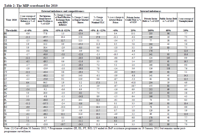
The European Commission has taken the report and produced another titled “Alert Mechanism Report” which has this table called “MIP Scoreboard” which highlights the imbalances in grey:
(click to expand in a new tab)
and makes observations on many individual nations – e.g., for Spain:
Spain: the economy is currently going through an adjustment period, following the build-up of large external and internal imbalances during the extended housing and credit boom in the years prior to the crisis. The current account has shown significant deficits, which have started to decrease recently in the context of the severe economic slowdown and on the back of an improving export performance, but remain above the indicative threshold. Since 2008 losses in price and cost competitiveness have partially reversed. While the adjustment of imbalances is on-going, the absorption of the large stocks of internal and external debt and the reallocation of the resources freed from the construction sector will take time to restore more balanced conditions. The contraction in employment linked to the downsizing of the construction sector and the economic recession has been aggravated by a sluggish adjustment of wages, fuelling rising unemployment.
The above is reminiscent of the Monetarist experiments of the 70s and the 80s where wages are squeezed by deflating demand (resulting in reducing employment instead of increasing it). No suggestion is made on how wages are to be negotiated. While I do not yet the best way to say the following, here it is: while wages are cost to firms, they are incomes to households and this strategy puts higher pressure on the fall in demand and creates a more recessionary scenario.
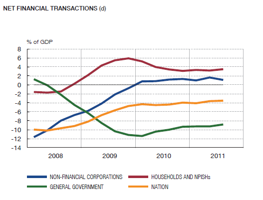
The Euro Area had no central government which is responsible for demand management in the broadest sense and individual nations having forgotten Keynesian principles, had haphazard policies from the start. In some nations, governments had a more relaxed fiscal stance but it was not seen in their budget balances because the domestic private sectors were happily involved in having its expenditure higher than income – adding to stronger growth and hence higher tax revenues. Thus the budget balance was seen under control. In others, this may have been the result of the private sector itself contributing to most of the increase in domestic demand by high net borrowing. The high growth in private sector incomes also led to deterioration in external balances of the weaker nations and the whole process was allowed to go due to irresponsible behaviour of the financial sector which was underpricing risk. Everyone was acting as if there was no balance-of-payments constraint (sectoral imbalances in general) which will hit hard someday.
When the crisis hit, governments realized that they had given up the ultimate protection (and simultaneously the lenders to governments) – making a draft at their home central bank.
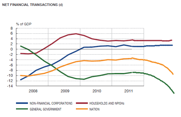
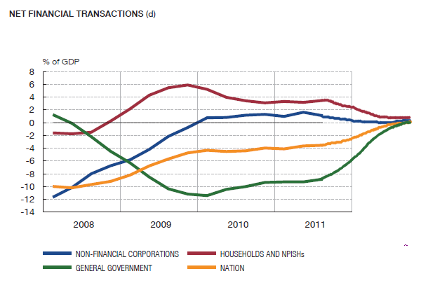
Let me offer an intuition on sectoral balances in general and not just for the Euro Area. While it is true that a “good” sectoral balance is one in which all the “three financial balances” are near zero, it is important that policy be designed (and bargained at an international level) so that these balances are brought to their preferred paths of staying near zero in the medium term without affecting the aim of full employment.
So imagine a closed economy. Most economists would suggest that – under certain conditions – the government should design policy to aim to reach a budget surplus (or a primary surplus) but this comes at the cost of lower demand and higher employment and hence a poor strategy. A higher fiscal stance – as opposed to targeting a balanced budget – will automatically lead to primary surpluses in the medium term because of the increase in demand and national income leading to increases in the government’s tax receipts. In open economies this gets complicated. Under the current arrangement a unilateral fiscal expansion by a nation such as Spain is ruled out because this will bring about a return to high current account deficits because of a faster rise in domestic demand than domestic output putting the nation on a different unsustainable path.
Now this may sound like TINA – but it is not if one thinks of alternative strategies which are aimed at bring the three financial balances from getting out of hand but with a coordinated fiscal reflation. However, this is difficult without there being institutional means of achieving the desired outcome and hence there is an urgent need for a more integrated Europe with higher spending and taxing powers for the European Parliament (unlike the 2% budget rule of Charles Goodhart) which will be induced in substantial fiscal transfers. Competitiveness also needs to be addressed but the powers of the government go beyond fiscal policy alone and policies need to be designed in a more integrated Europe which reduce transfer addiction such as a common wages policy as suggested by George Irvin and Alex Izurieta in their article Fundamental Flaws In The European Project (August 2011):
Policy action is necessary if these trade imbalances are gradually to disappear. Crucially, labour productivity must increase faster in the deficit countries than in the surplus countries, an aim difficult to achieve unless proactive fiscal policy and infrastructure investment trigger a modernising wave of “crowding in” private investment. This means that Europe must redistribute investment resources from rich to poor regions. In addition, if higher labour productivity growth is to be achieved in the periphery, a “common wages policy” (not to be confused with a common wage) must be adopted which better aligns wage and productivity growth and sustains aggregate demand. This will not be achieved with wage disparities exercising a deflationary impact on the union. In the absence of national exchange rate realignment, adjustment must take place through a regional wage bargaining process.
Update: The European Commission background paper “Scoreboard For The Surveillance Of Macroeconomic Imbalances” is available at here.
